Creating a serene and calming environment in your home starts with the colors you choose. Color affects mood and can significantly impact how comfortable and peaceful a space feels. If you’re looking to refresh your home with a calm atmosphere, choosing the right hues is key.
In this post, we’ll explore practical tips for selecting calm colors for your home, helping you transform any space into a soothing retreat.
Why Choose Calm Colors?
Calm colors promote relaxation and reduce stress. They are perfect for spaces where you want to unwind, such as bedrooms, living rooms, or reading nooks. Unlike bold or vibrant colors, calm tones encourage tranquility and balance.
Some commonly calming colors include soft blues, gentle greens, muted neutrals, and warm grays. These shades tend to mimic nature — like the sky, trees, and earth — which naturally evoke peace.
Tips for Selecting Calm Colors
1. Start with Neutral Base Colors
Neutral colors, such as beige, cream, taupe, or light gray, make excellent foundations. They provide flexibility to add accent colors later and keep the overall look subtle and restful.
These tones won’t overpower a room and can visually open up smaller spaces. If you want a calm, minimalist vibe, sticking to a neutral palette might be all you need.
2. Choose Soft Blues for Tranquility
Blue is often associated with calm and serenity, making it an ideal choice for bedrooms and bathrooms. Light blue tones can help reduce anxiety and promote peacefulness.
When selecting a blue, opt for muted or pastel versions rather than bright or navy blues. Examples include powder blue, sky blue, or soft teal hues.
3. Incorporate Gentle Greens for a Natural Touch
Green connects us to nature and has a soothing effect. Soft green shades, like sage or mint, provide a refreshing, calming atmosphere without feeling too cold.
Green works well in living rooms, kitchens, and any area where you want to foster a comfortable, balanced mood.
4. Use Warm Grays to Add Sophistication and Calm
Warm gray tones combine the neutrality of gray with a touch of warmth that prevents spaces from feeling sterile. Shades like greige (gray + beige) bring coziness while maintaining a calming palette.
Warm grays work well in modern and traditional interiors alike and pair beautifully with natural materials like wood and linen.
5. Keep Color Contrast Low
High contrast color schemes (like black and white or bright yellow with navy) energize a space but aren’t typically calming. For peaceful rooms, choose colors that blend gently.
Limiting contrast allows your eyes to rest and helps create visual harmony. Choose shades with close tonal values to keep the room soothing.
6. Consider the Lighting
Lighting can change how colors appear in your room. Natural light tends to enhance the freshness of calm colors, while artificial lighting might make some shades appear warmer or cooler.
Before committing, test paint samples in the space at different times of day to see how the color reacts to light.
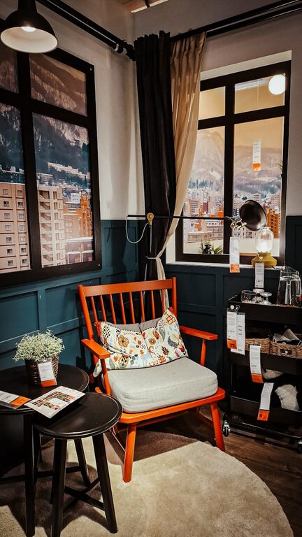
7. Add Texture and Soft Accents
Colors aren’t the only way to create calm. Adding texture through soft fabrics, cushions, rugs, or curtains complements calming colors and brings depth and comfort to the room.
Light-colored wood furniture, matte finishes, and natural fibers emphasize the relaxing feel.
8. Limit the Number of Colors
While layering colors can be inviting, too many hues can feel chaotic. Aim to use two or three main colors or shades in a room to maintain a calm and cohesive environment.
For example, pair a soft blue wall with warm gray furniture and beige accents for a balanced look.
Quick Color Suggestions for Calm Rooms
| Color | Best Used In | Mood Effect |
|—————-|———————–|———————|
| Soft Blue | Bedrooms, bathrooms | Peaceful, tranquil |
| Sage Green | Living rooms, kitchens| Refreshing, balanced|
| Warm Gray | Living rooms, offices | Cozy, sophisticated |
| Pale Beige | Any room | Neutral, airy |
| Blush Pink | Bedrooms, lounges | Gentle, nurturing |
Final Thoughts
Choosing calm colors for your home is a wonderful way to create a peaceful sanctuary. By selecting soft, muted tones and balancing them with natural textures and gentle lighting, you can craft spaces that help you relax and recharge.
Remember to test samples, prioritize comfort, and keep your palette simple. With these tips, your home will soon feel inviting and serene, just as a calm color scheme should be. Happy decorating!